
Telehealth Virtual Visit
overview
This design challenge was part of a hiring process with a healthcare software company.
The task was to design a virtual visit interface for both patients and physicians, enabling seamless collection, organization, and analysis of health information. The primary objective was to capture all of this information in a way that is easy, informative, and fun to use.
role
UX/UI Designer
user journey map, wireframing, and prototyping
duration
10 hrs
STEP 1.
background
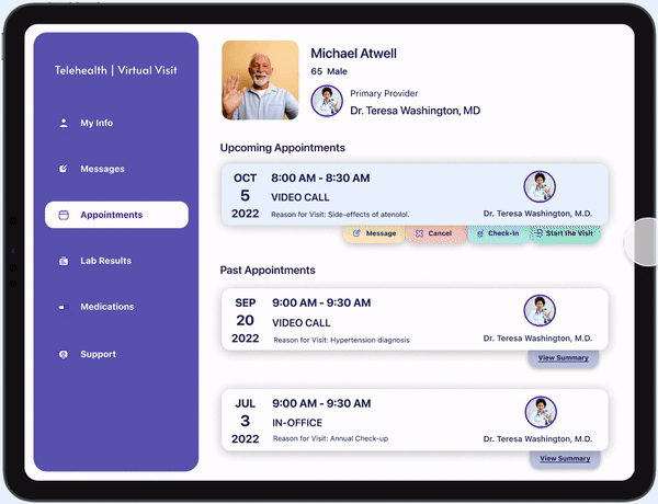
For the challenge, I was given a scenario with specific users named Michael and Dr. Washington. The use case revolved around the patient, Michael, scheduling and attending a virtual visit with his doctor, Dr. Washington on a telemedicine app. Throughout the whole process, Michael uses his iPad while Dr. Washington is on her PC.
Given this scenario, I pulled information and organized them into user stories and needs.

STEP 2.
user journey map
I thought through the user flow to try to understand the users' respective experiences and interactions throughout the virtual visit process. By visualizing their journeys, I identified key touch points as well as areas of alignment. This helped me visualize a design where the interface designs and user experiences catered to the specific needs of both the patient and physician.
Michael Atwell's Journey

Dr. Teresa Washington's Journey

STEP 3.
lo-fi wireframing
Michael Atwell's Journey

Dr. Teresa Washington's Journey

STEP 4.
final designs
With a deadline of 10 hours and a bunch of information being provided, I wasn’t able to invest a lot of time in research. However, I still felt that I needed to gain a sense of familiarity with electronic health systems and the virtual visit experience.
While designing the layout and styles of components, I tried to put myself in the perspectives of the users. As a senior patient for example, I would want a simple interface that allows for easy visual scanning. I also tried to choose a color scheme that fits the playful theme that this particular healthcare software company values.

